Creating Vibrant Workspaces
Creating a vibrant workplace involves a lot of discussion about aesthetic, functionality and relevance to your particular industry. Every office environment is unique. It can be influenced by the nature of the work performed by your business, the architecture of the building, and the personalities of the people within the space. It’s also impacted by workplace culture and design. With the constant push for talent acquisition, color has become a key player in modern office design. It can greatly influence mood, productivity, office culture, and connectivity.
The biggest corporate color statement is often found in your branding and messaging. But it should not stop there. Translating that over into your office environment gives the space your unique personality and vision. It performs a very specific function in the storytelling of your brand. The right office color scheme can start a conversation that can invite customers, inspire staff, and designate zones that support a variety of functions and flow within the workspace.
Vibrant Workspaces
Color synchronized with texture is perhaps the most influential and powerful element of commercial interior design. The corporate tones of beige, gray and white have given way to bursts of color in unexpected places around the office. And for those still intimidated by the bright and bold, hue and tonal range has become the instigator for change within office design. When Pantone released their color trends for 2018 they noted some things to consider about color in the workplace:
- The interplay of opposites on the color wheel, like blue juxtaposed with orange, keep things bright and fresh
- Neutral metallics are a perfect fit for a polished yet future-forward look, and they can quickly update a neutral palette
- Globally-inspired hues, which are found in nature, offer a warm welcome
- Targeted usage of bright colors works well for huddle spaces, filing storage pieces, chair fabrics, accent walls, or floor coverings
If you are in an office space that you own, where you can alter the environment as you see fit, then you’ve got carte blanche. If not, then it becomes a strategy because it’s up to the furnishings, fabrics, floor coverings and artwork to bring color into the workspace. Sometimes you can get away with painted accent walls, so find out up front about that if you are in a rental space. However, if that is not an option, you might be surprised with what large-scale art pieces can do to add color, texture, and graphics to a neutral space that you cannot customize. So don’t let leasing be a stumbling block for color in your workplace.
WARMING UP COOL COLORS
The typical neutral, cool office tones of gray, taupe, blues and darker greens are meant to calm things down. Shifting a gray hue toward the blue or even aubergine range is one way around a neutral color block. Blue has long been considered a color to inspire focus and stability, which is why companies like IBM and Microsoft use it in their logo. As an office color, it tends to be either conservative navy or tropical bright turquoise. Finding a medium hue will last longer than a style season. Avoid jumping on a trend if you want longevity in your decor.
Green is the color of relaxation. Walls or paintings in shades of green create feelings of calmness and relaxation in employees. Green helps in reducing anxiety and is restful on the eyes, which is why it has a reputation for being a clinical hue. In a corporate space, you can best achieve this color with vibrant plants, or maybe even a living wall installation. Plants perform the dual function of beauty and cleansing the air.
Warming up these very cool colors requires the natural element of wood. The tonal quality of wood harbors rich shades of yellow, red, brown, and black. Depending on how it’s finished, a nice pine could become vibrant orange set against a blue wall, so it feeds into that trend of the juxtaposition of opposites. Wood is a formidable companion to warm up any cold space, from mid-century modern to traditional office design. Furniture and wall installations composed of wood can add wonderful texture to even a leased office space….and you get to take it with you when you leave.
TONING DOWN WARM COLORS
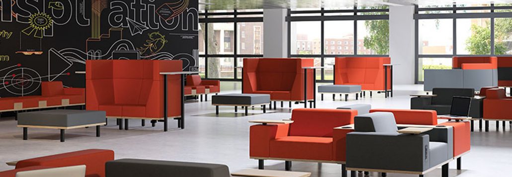
The globally-inspired hues of sunset: red, orange, and yellow fit into this category. These are the passionate conversation starters, they inspire creativity and action. Think about how Coke® has used this color in their branding over the years. It makes a statement. But these bold colors, if overused at full intensity, can become jarring and disruptive. If they become too pastel, they become weak, bland and boring. These are hues that function very well as pops of color to designate huddle spaces, creative zones, and breakrooms. Utilized in a neutral gray space they become heroes as a design element because they attract your attention.
Texture becomes very important here. Elements of metal and darker tones of wood can tone down intense hues. As can the addition of darker foliage plants. If you have dark floors the pops of color can elevate the design. Creating a darker foundation for the furnishings to sit upon will create the much-needed contrast to stabilize bold colors. Vibrant fabrics are coming out on chairs and accessories this year. Office furniture seating and customizable panels or glassboards can easily integrate these colors into your open office design. If you cannot paint, artwork can easily provide vibrancy and be changed as your preferences change.
Office paint colors can have a tremendous impact on workplace morale and culture. A study by researchers at the University of Texas found that colors can have an impact on mood, productivity, and even absenteeism. Gray and beige, which are still found in a lot of corporate offices, tend to create feelings of depression for women. Brightening up the office with purple and orange could induce the same feelings in men.
NEUTRALS STILL HAVE A LOT TO SAY
Neutrals still hold sway in traditional corporate office design. They provide a firm foundation for color to flourish as a design element. Without the gray carpets, dark tile floors, and standard black office chairs that minimize dirt and conceal traffic flow, color would not have nearly the impact it has on workplace design. It’s been said that every room needs black to ground the space. That is where gray has landed in the workspace design of today. Darker wood tones, black metal accents, and hardwood floors are also making appearances in commercial office design as a new level of comfort is being applied. All in all, neutrals give color a strong stage upon which to play out your brand story.
In the hands of a seasoned space planner and designer, the colors of your office will create a vibrant story about your brand without a word ever being spoken. This is the secret to memorable corporate design. Our showroom has some great ideas to transform your workspace into a hive of innovation.
 MEET ERIKA BARNES: Erika brings a lengthy retail management career to her furniture sales acumen. Her creative mind and excellent customer service will help you find the right voice with color in your workspace. Connect with her via email ebarnes@officefurniturenow.com or by calling 888-910-3769 x131. For more inspiration visit us on Facebook, Pinterest, and Twitter!

