
WATERCOOLER CHAT: Sherwin-Williams Colormix 2026
Sherwin-Williams Colormix® 2026 Anthology Volume Two biennial trend report explores the evolution of key color groups. Sherwin-Williams’ expert Trendsight Team studies color movement across the globe to create these four essential palettes that will guide the future of residential and commercial design. Let’s explore the Colormix 2026 pallets in a little more depth as they relate to current office design trends.
Anthology Volume Two welcomes a world of frosted tints, rich reds and golds, restorative darks, and complex neutrals. The SW Color of the Year for 2026 is Universal Khaki SW 6150, featured in the Foundation Neutrals palette. The annual Colormix Forecast is a trend collection curated by Sherwin-Williams’ global color and design experts to explore the hues that will decide tomorrow’s color directions across various industries and surfaces.
Color significantly impacts every environment we experience. As residential + hospitality design continues to trend high in office design, we are seeing more saturated expressions shifting into office color stories. Office design trends for 2026 focus on creating flexible, well-being-focused, and technologically advanced spaces that cater to hybrid work models. The goal is to create human-centric environments that support productivity, employee well-being, and flexibility for diverse work styles. Key elements for transitioning Colormix 2026 into these environments include:
- Adaptive and modular hybrid layouts with progressive design to enable more flexibility.
- Sustainable design elements human-centric environments that incorporate biophilic elements.
- Deeper brand immersion to create spaces people want to be with hospitality-inspired amenities.
- Seamless technology for collaboration within and for remote working.
Here is a snapshot of the hues available in the Colormix 2026 forecast and how they fit into these trends. We encourage you to get creative with these options! Many of these colors can easily transition into your workplace through art, fabrics, and upgraded design elements like feature walls in key locations. Explore how your brand colors can subtly shift into alignment with these updates. Integrate color changes gradually based on your business model. Our design team is available to help you visualize your office upgrade. Get inspired by visiting our Workspace Color Stories page!
Sherwin-Williams 2026 Colormix Preview
 FROSTED TINTS are an evolution of the subtle tints from previous forecasts. Milky pastels are making a magnificent return. For commercial spaces, frosted hues will work well in healthcare spaces and quiet zones. Hushed organic tones enhance the healing connection people have with nature, adding a dose of comfort and supporting rest and recovery. Set them in privacy spaces, health-focused restorative breakout spaces, and huddle spaces for a subdued, tranquil effect.

SUNBAKED HUES frequent hospitality spaces like hotels and restaurants. Dominant in midcentury modern design, they create memorable immersive experiences through textures and lighting that evoke specific emotions. If you are seeking to connect clients and guests with the rich culture of the destination, this is a great choice! Today’s hospitality designs feature locally sourced materials and artwork in a vibrant, warm color palette that celebrates an area’s history and traditions.

RESTORATIVE DARKS provide a stabilizing feeling that retains longevity into the future, and provide reassurance with the kind of comfort worth settling into. Alongside residential styling, employees desire a functional and effective workspace that supports their personal work style. Because everyone works differently, offering a variety of work settings, enhanced with a range of cocooning colors that evoke calm and focus for a positive, productive workplace.
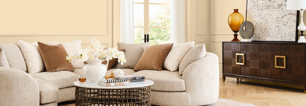
 FOUNDATIONAL NEUTRALS offer seasonless, sumptuous, and unparalleled depth into today’s essentials, suggesting a shift from divinely delicate to a future of curated contrast and complexity. Neuroaesthetics, the study of how the brain responds to beauty, art, and other visual experiences, plays a crucial role in educational settings with neutral color palettes, natural daylight, multifunctional zones, and elements that create quiet environments and add a layer of design interest.
Sherwin-Williams Colormix 2026
Photos from Sherwin-Williams


