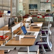
The Collaboration of Color In Your Office Design
The collaboration of color is an integral part of creating meaningful workspaces that encourage productive behaviors. Corporate office design has been in a neutral zone for a very long time. Take a look around your office. Are the walls dull and reminiscent of an institutional building rather than a place of dynamic collaboration? Punching up your agility with color is one of the simplest ways to create a culture of innovation.
Before you break out the paint rollers, take into consideration your company’s core activities and vision. Color should always be a collaboration of what your brand represents as well as your goals. Utilizing your branding colors and messaging is a great place to begin your color story because it allows your clients and your staff to follow along with your core initiatives.
Consider how your team works: Do your employees need to be innovative and creative, complete focused tasks, or carry out physical duties? The collaboration of color in your workplace is relative. It’s not just the color that matters, but how bright it is. A strong bright color will stimulate, and a more subtle color will soothe.
The Collaboration of Color
Office furniture designers incorporate color studies into their research and development and have stepped up their game with bolder chair colors, integrated colored glassboards, partitions, and cubicle fabrics which can be customized to fit your branding. If you’re testing the waters, meeting spaces are a great opportunity to introduce bold colors to stimulate creative ideas and conversations. But don’t just limit color to breakrooms, conference rooms or reception areas. Integrate color into all environments by including:
- Accent walls
- Carpets/Rugs
- Plants
- Accessories
Believe it or not, there actually is a science behind color in the built environment and how it transcends the workspace. There needs to be a transition between capturing a sense of play with color and appealing to consumers that interact with it on a daily basis. This use of color in the office environment is supported by a groundbreaking study by the University of Texas which confirmed that color does, in fact, elicit a reaction in the brain and can subsequently affect workplace moods and overall productivity. Here is some colorful food for thought:
RED is a very physical, reactive color. It represents courage, strength, and excitement. Red is stimulating, it gets your heart pumping and raises your pulse. In a collaborative environment, it is a powerful color that can evoke conversation and thought movement, which is great if you’re not easily phased by dynamic situations. Too much red can be a bit overstimulating and actually hinder your work efforts. It’s a very common brand motivator. Workers that require a lot of physical exertion such as salespeople, personal trainers, and ideators, may respond well to red.
YELLOW is the emotional color that represents creativity, friendliness, optimism, and confidence. Incorporate yellow when you want to stimulate positivity, creativity, and happiness in your environment. Yellow is energizing and radiates positivity. It lifts confidence levels so it is excellent for getting you into the right mood for producing great work. It’s perfect for huddle spaces, breakaway spaces, think-thanks and HR offices. Yellow is the color of innovators and entrepreneurs. If you’re stuck in an idea rut, yellow can help get the creative juices flowing and make you more optimistic about the direction you’re taking.
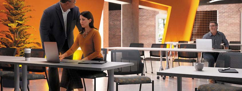
ORANGE blends the physical (red) and emotional (yellow), creating a sense of comfort. It is often associated with food and warmth. When used appropriately, it is a fun color, making it an option for casual office lounges, training environments or breakrooms. As an accessory color, it will stimulate focus, concentration and promote organization. This makes it the perfect hue for a home office. If you are working in a gray neutral environment, orange is a great accent color for your chair, desktop or artwork for the walls.
GREEN provides balance. It represents harmony, nature, and restoration. Green encompasses Biophilic design and ergonomics and proves to be a great color in offices that require people to work long hours since it’s the easiest color on the eyes. If a sense of equilibrium is a top priority then green is your color, which is why it’s commonly found in medical offices. It strikes a nice balance between the other primary colors and creates a sense of calm and reassurance. This is particularly helpful if you feel overwhelmed by all the tasks you need to complete. If you want to create an oasis in your office environment for solitary tasks where focus is important, bring in green with plants, a window wall that looks out onto a forest or even a breakaway space in the form of an accessible garden would be appropriate.
PURPLE is often associated with spirituality or luxury. It can promote deep contemplation but should be used carefully, as too much of it or the wrong hue can have an opposite effect. It is said to have the power to uplift, calm nerves and encourage creativity, making it an all-inclusive color. Purple is more suitable for products and websites related to women or children. Academic institutions often use medium shades of purple or violet as they inspire intellectual thought and achievement. Law firms where research is done would also be a good application for a deeper shade of this color in a library or study environment.
GRAY, along with beige, is one of the most common neutral office colors. It is frequently used in offices attempting to look sleek or modern. Gray can take on other hues like navy, aubergine or dark taupe. Have a strategy in mind when incorporating gray in certain spaces and be sure to balance it with other colors so it is not the focal color. When used inappropriately, it suggests a lack of confidence and can stimulate suppression. Use gray in furnishings or as an accent color to highlight the bright colors you want people to notice, and to anchor an otherwise light or brightly colored environment. Be careful of using it to divide or define spaces because it might be counterproductive to collaboration.
When moving from a traditional neutral office to one that incorporates color, working with a space planner and designer is a great option. Their expertise and knowledge will be able to guide you toward educated decisions that will work best for a collaborative environment designed to meet the productivity goals of your business.
 MEET ERIKA BARNES: Erika brings a lengthy retail management career to her furniture sales acumen. Her creative mind and excellent customer service will be a strong asset in partnering with you to create a bold collaboration of color in your workspace. Connect with her via email ebarnes@officefurniturenow.com or by calling 888-910-3769 x131. For more inspiration visit us on Facebook, Pinterest, and Twitter!
